Blackout is a short crime thriller centered around a single, tightly organized operation. The movie is based on a masked hitman called Matheus, who is dropped at a target house by the contractor’s assistant called Massimo. Under the remote guidance of the contractor, called Tati, who instructs him through an earpiece from a nearby location, Matheus forced his way into the house, stamped down and knocked out the homeowner, Cesar, and got him into the trunk of a Mustang to complete the handoff. The film is structured around tension, parallel editing, and a sense of consequence rather than spectacle-driven action. The three products, which are the film itself, the Instagram promotional campaign and the festival postcard, were produced to be used as one package with a consistent visual identity.
One of my key creative decisions was how I chose to represent the characters and the criminal world they operate in. The film does not provide the viewer with a clear moral guide, nor does it present Matheus as a hero. He is a professional and systematic person, yet what he is engaging in is a home invasion and kidnapping. The film does not attempt to justify his actions or frame them as morally acceptable. This is supported by the role of Tati, who is efficient and professional in giving directions and making the operation run smoothly. This was intentional, as I chose to present the criminal activity using the language of professional procedure. This reflects how films such as Heat and Sicario portray their operatives as calm and competent within morally complex situations, individuals who are both good and calm in scenarios that are ethically tricky. The viewer is engaged in the drama of witnessing a person performing very well in something that he/she is not supposed to be doing.
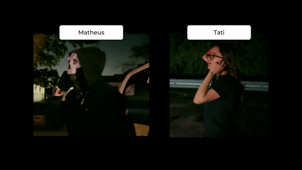
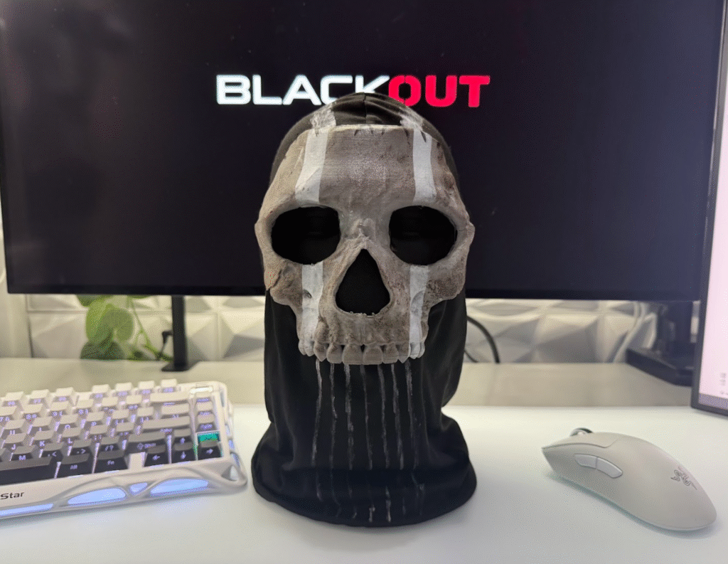
The costume choices were central to constructing the characters identities and how they were understood by the audience. The mask Matheus wears became one of the central visual symbols of the project. Beyond its practical function of hiding his identity, it removes any visible facial expression, making him harder for the audience to read emotionally. This lack of expression creates distance and contributes to a sense of discomfort, as viewers are unable to fully understand what he is thinking or feeling. Tati’s appearance was designed to complement his without mirroring it; she is a long-distance operator, so her looks are not tactical but rather calculated. The way they are visually framed in relation to each other establishes a clear power hierarchy without it being explicitly stated. In the early development stage, I planned a full Ghost-inspired tactical outfit based on Simon “Ghost” Riley from Call of Duty, including a helmet and night vision goggles. That idea was ultimately scrapped for practical reasons. The bulk and instability of the full tactical outfit would have made physical scenes, such as the fence climb, difficult to film effectively. Simplifying the costume to just the mask actually strengthened the character’s visual impact. By focusing on one distinct element rather than full tactical gear, the design became more striking and memorable.
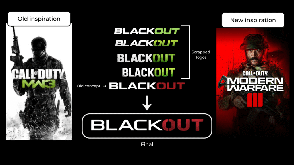
The branding of all three products was developed around a consistent visual identity: dark background, strong contrast, and red as the prevailing accent colour. The title design, with the word ‘OUT’ consistently highlighted in red, became the most identifiable aspect of the entire package. During early development, the colour palette was primarily tactical green, reflecting the influence of Call of Duty: Modern Warfare on the original direction of the film. As the narrative shifted toward a more grounded and gritty crime thriller, the green palette no longer aligned with the tone of the film. Red was chosen instead because it more effectively conveyed tension, danger, and consequence, which became central to the final version of the story.
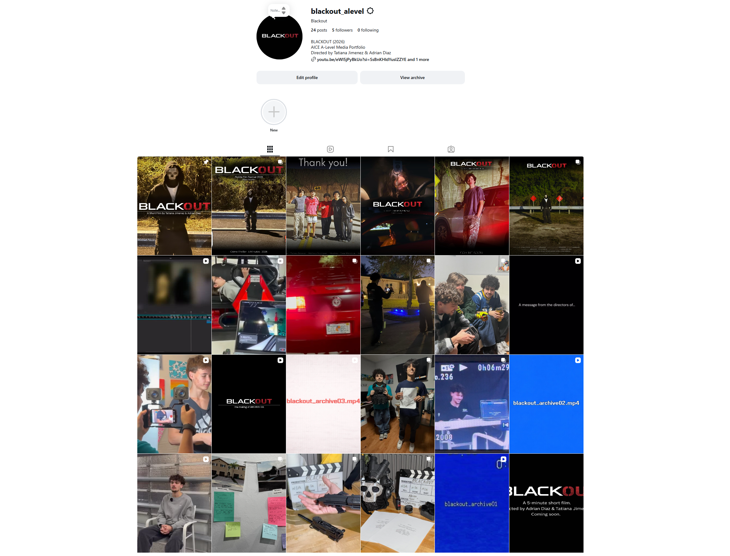
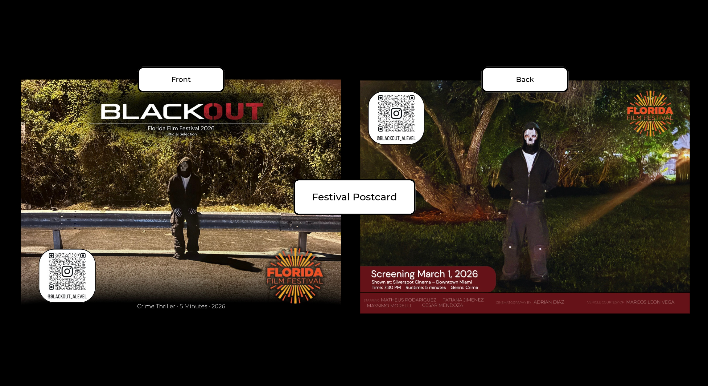
This visual identity was used consistently across the Instagram campaign and the festival postcard. The Instagram page featured 24 posts by the time the film was officially released, including early teasers, archive clips, cast cover arts, behind-the-scenes, time-lapses of the editing process, and the actual announcement of the release. The posts followed a consistent visual format, including dark gradients, the emphasized red title, and cinematic framing. This consistency allowed the grid to function as a cohesive campaign rather than a collection of separate updates. The cast cover arts of Tatiana Jimenez and Massimo Morelli were designed to replicate the quality of professional character one-sheets with dramatic light effects and a credit block placed at the bottom to correspond with the theatrical film poster traditions. The festival postcard required a slightly different approach. The design was primarily informational, so clarity was prioritized. The screening details were placed within a large red panel on the back, while the masked character image took center stage on the front. The physical campaign was connected to the digital platform through a QR code that directed viewers to the Instagram page.
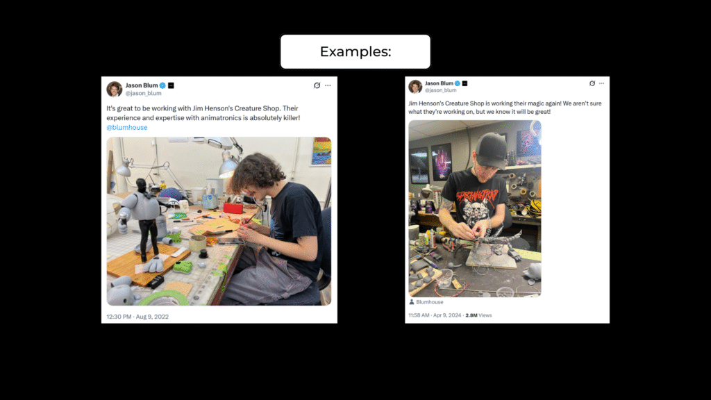
Audience engagement was a key focus of the campaign. By presenting the Instagram feed as an ongoing production journey, I encouraged repeated interaction and sustained interest instead of limiting promotion to the final release. This was based on the concept of the Five Nights at Freddy movie, where the behind-the-scenes and cast introduction material were used to create investment to the audience prior to the release. The format of the Blackout campaign was also similar; teasers and archive clips were published periodically to create a hyped-up atmosphere. The CCTV-style archiving videos were also quite successful, teasing shots in a certain way, but not revealing the storyline.
For the YouTube release, I included both English and Spanish subtitles, which were manually written rather than auto-generated. The Spanish subtitles were adapted to preserve tone and meaning rather than translated word for word. This decision reflected an awareness of the likely bilingual audience; a bilingual audience is a true component of the target audience of a crime thriller with this kind of visual presentation. Labeling the project as a “Florida Film Festival 2026 Official Selection” on the postcard and Instagram elevated its perceived status. This strategic framing shapes audience expectations, positioning the film as a professional production rather than a typical student project.
This project was influenced by practical research during production. One of the earliest inspirations for the visual direction was the fan-made military short film Threat Level: 6 by BYL Tactical. Despite having no professional budget or studio support, it achieved a cinematic look through careful planning and attention to realism. This demonstrated that limited resources can still produce strong visual results when executed strategically.
In the initial planning stage, I intended to use a drone shot to reveal the target house from an aerial perspective, inspired by how Threat Level: 6 established scale and danger through camera movement. However, after testing the drone, the camera quality felt inconsistent with the cinematic tone of the film. As a result, the aerial reveal was scrapped. Instead, the low-quality footage was repurposed for the “lost tape” sequence, where its degraded appearance was intentionally styled to resemble archival VHS material. This decision ultimately strengthened the atmosphere and added depth to the film’s lore rather than distracting from it.
During early development, I was influenced by the finale of Breaking Bad, particularly its restrained and consequence-focused ending. I initially considered ending Blackout with a similar reflective shot of Matheus lying on the floor, emphasizing finality and emotional weight. However, this idea was later scrapped because it no longer aligned with the direction of the film. Instead, the final version concludes with Matheus completing the handoff, receiving payment, and Tati launching the Mustang in a burnout. Although visually energetic, the moment is not framed as celebration. The tension-building sound design continues as the logo appears, and the film cuts to credits with tactical-style music. Rather than offering clear moral resolution or heroic triumph, the ending reinforces the continuation of the criminal hierarchy, leaving the audience with a sense of controlled power rather than closure.
There were several additional research-based influences that shaped my editing decisions. The foreshadowing CCTV sequence at the beginning of the film, where Matheus appears on a security monitor without realizing he is being watched, was inspired by the surveillance style of Five Nights at Freddy’s. I incorporated camera sound effects and scan-line distortion to create an unsettling, monitored atmosphere. The action scene required detailed frame-by-frame sound design, with each impact carefully matched to on-screen movement and enhanced with subtle reverb and bass to add weight. To make the earpiece communication sound realistic, I compressed the audio, adjusted the frequencies, and layered in radio static to simulate a tactical device.
Overall, research actively shaped both the technical execution and creative direction of the final film, influencing how tension, realism, and atmosphere were constructed.