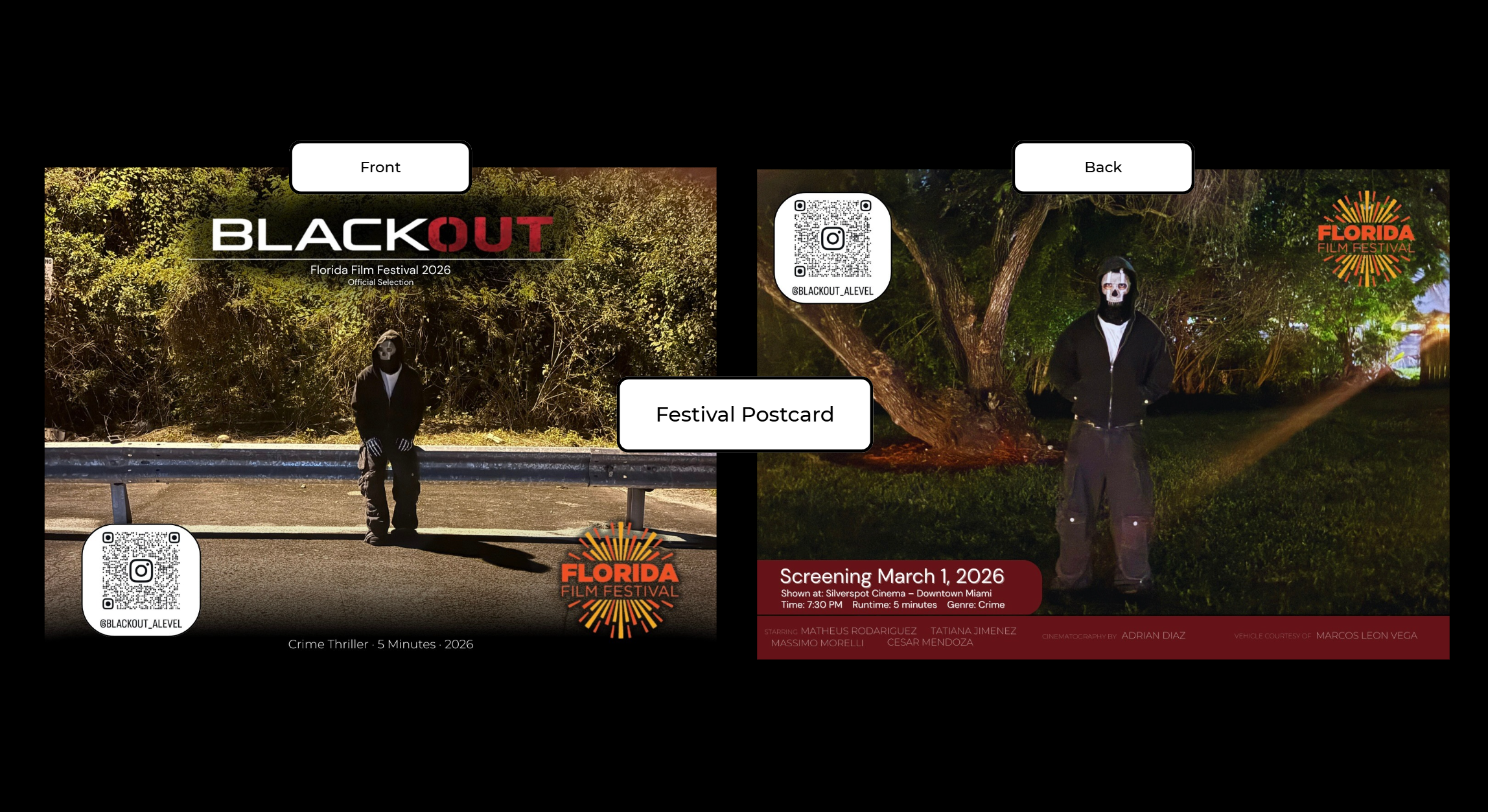
With the film officially released, the focus has now shifted entirely to the festival presentation component. The next major deliverable for this project is the festival postcard, designed specifically for a screening audience rather than a social media feed. Unlike the cast cover arts or thumbnails, this design needed to function as an informational promotional piece while still maintaining the established visual identity of Blackout.
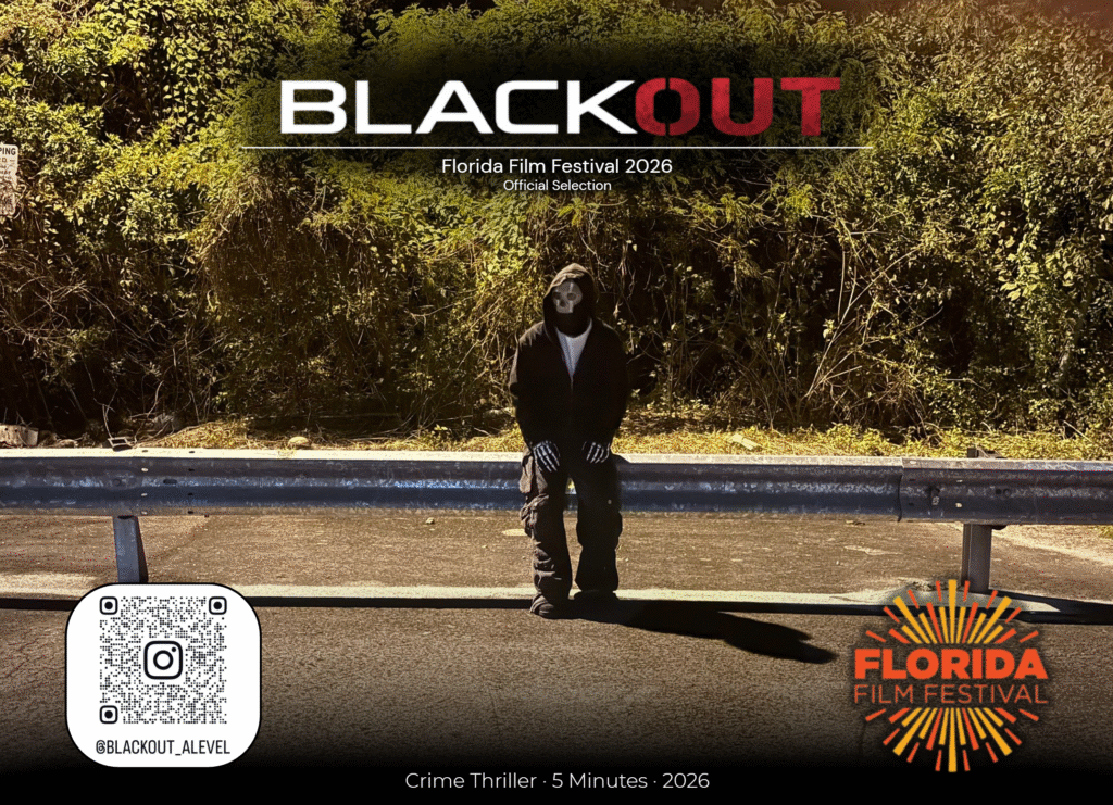
The front of the postcard centers around a strong, isolated image of the masked character positioned against a natural backdrop. The BLACKOUT title remains dominant at the top, with the red emphasis on “OUT” continuing the established branding. Beneath the title, the “Florida Film Festival 2026 – Official Selection” text reinforces legitimacy and situates the film within a professional context. The goal was clarity first, impact second.
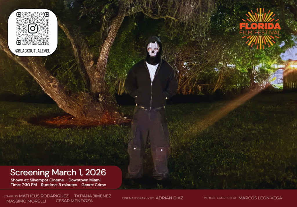
The back of the postcard is more informational and structured. It includes the screening date, location, runtime, and genre, presented inside a bold red panel to create contrast and draw immediate attention. The Florida Film Festival logo is placed prominently for recognition, while the QR code links directly to the project’s Instagram for extended engagement. The credit block at the bottom mirrors theatrical poster conventions, reinforcing professionalism.
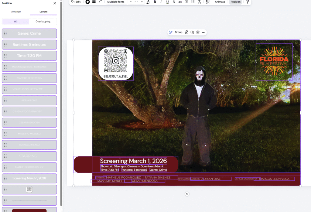
A significant part of this process involved adjusting layout precision inside Canva. I spent time refining spacing, alignment, and hierarchy so that the information did not compete visually. The positioning of the QR code, festival logo, and screening details required multiple small adjustments to maintain balance across the composition.
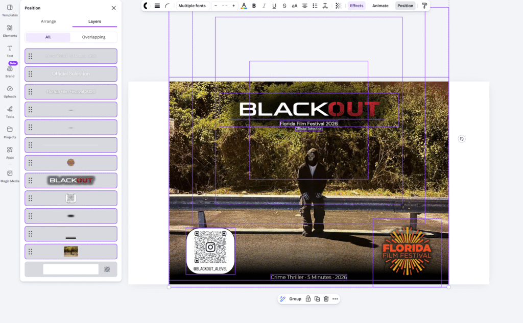
The darker gradient overlays were also intentional. They help anchor the typography and prevent it from blending into the background image. Without those overlays, the text lacked readability. With them, the design feels controlled and structured.
Compared to earlier promotional materials, the postcard feels more formal. It is less about cinematic mood and more about clarity and event presentation. That shift was intentional. The purpose here is to communicate screening details efficiently while still maintaining the thriller aesthetic established throughout the project.
At this stage, the creative production and release phases are complete. The festival postcard now represents the final physical promotional component of the project, tying together the branding, screening details, and professional presentation in one cohesive design.
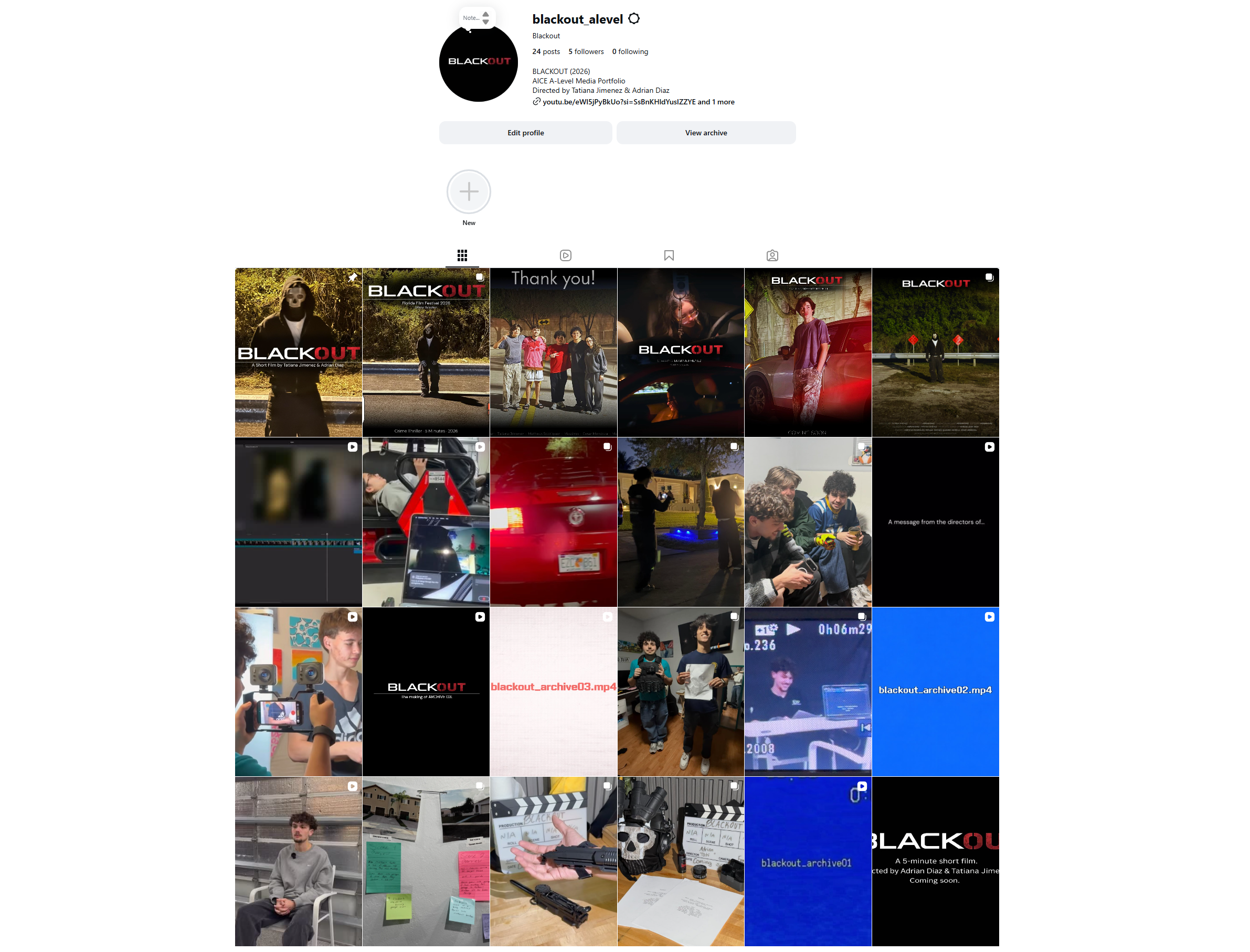
With the postcard finalized, the next step is the full reveal of the completed social media rollout. The entire Instagram feed is now structured and curated as a unified promotional campaign rather than individual posts.
That full reveal is coming next.
More updates soon.